A FRESH PERSPECTIVE / AI AD CREATION
One product.
Three perspectives.
Finished advertising concepts for VERDE, a fictional skincare brand. A consistent product identity explored through three settings, messages and moods.
Creative direction · AI image production · Copywriting · Comparison planning / BEMRIX
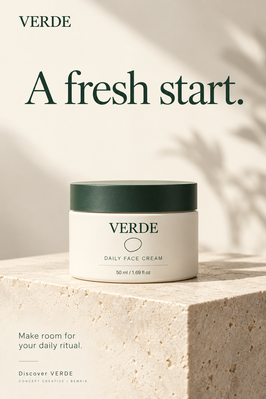
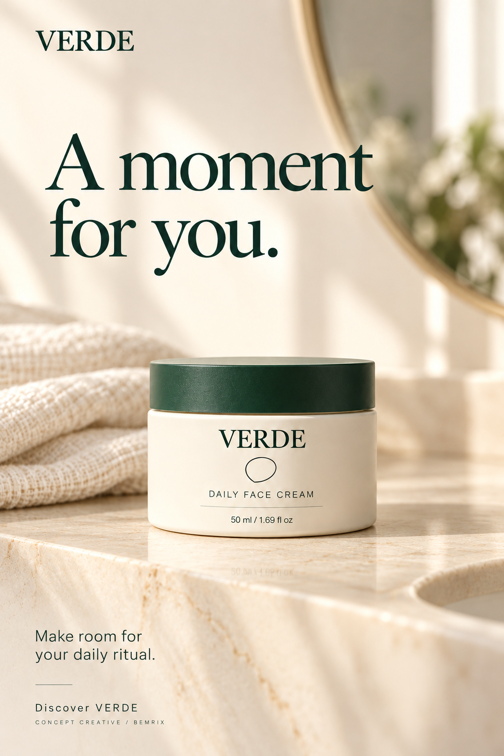
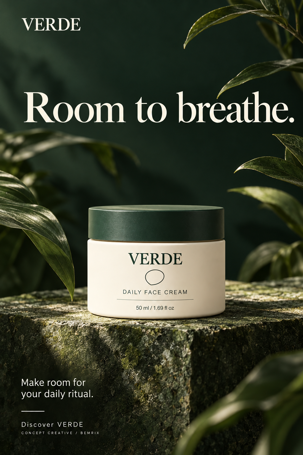
AI-generated concept imagery, including product and typography. VERDE is fictional; these are not photographs of a manufactured product.
01 / THE BRIEF
Explore the message.
Keep the product familiar.
The brief was to introduce a daily face-cream concept without relying on discounts or unsupported benefit claims. The creative uses a calm invitation: “Make room for your daily ritual.”
An ivory jar, forest-green lid and a defined label reference connect the three executions. The setting and headline change; the brand, product name, supporting line and call to action remain consistent.
02 / THE DIRECTIONS
The clean introduction
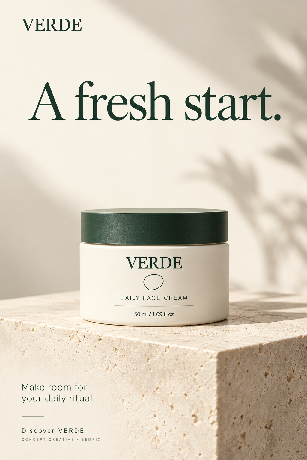
A fresh start.
A single jar, warm stone and generous space. This direction makes the product the first thing to understand.
The question to explore
Could a clear product-first composition encourage more qualified visits?
Download this creative ↓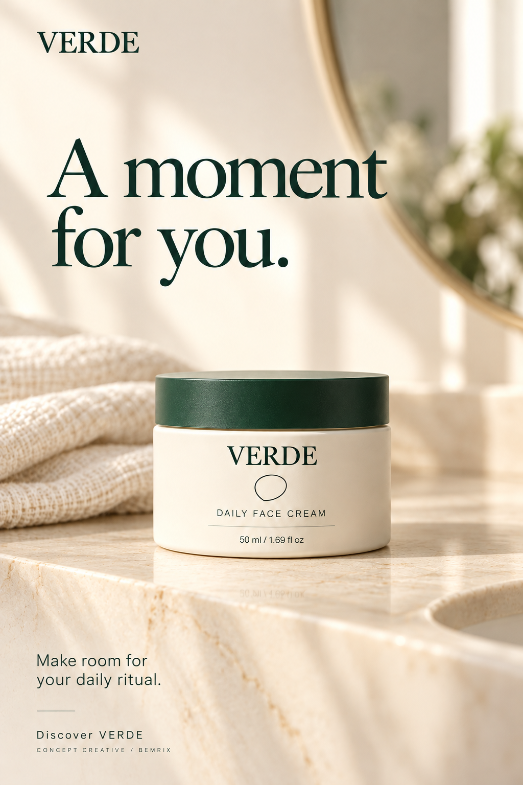
The everyday moment
A moment for you.
Linen, a mirror and morning light place the same product in a familiar routine.
The question to explore
Could a familiar setting make the brand feel more relevant to the audience?
Download this creative ↓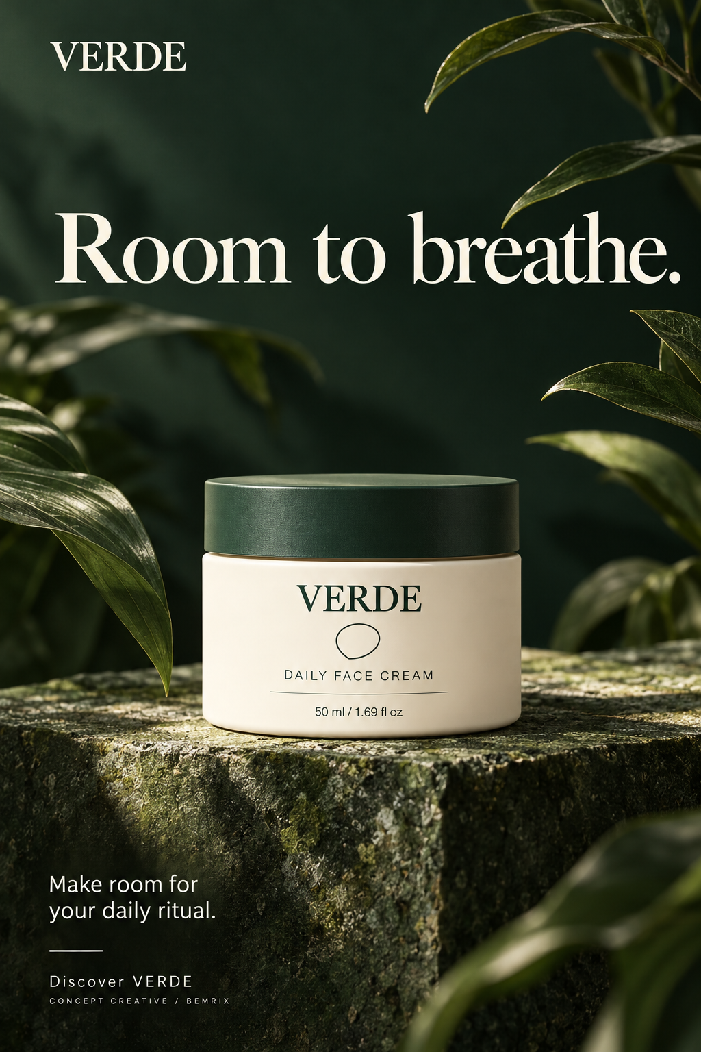
The atmospheric statement
Room to breathe.
Deep greens and sculptural leaves create contrast around the ivory jar. Botanical styling is visual mood, not an ingredient claim.
The question to explore
Could a stronger tonal contrast attract attention while keeping the product readable?
Download this creative ↓03 / THE MAKING
A reference.
A direction. A review.
- Define the product
A simple editable label establishes the wordmark, product name and volume.
- Generate with a shared reference
The first approved visual becomes the product reference for the other settings.
- Review the output
Check copy, label legibility, product shape, contrast and composition. Generated details can vary; production work with a real product would use approved product photography or precise compositing.
- Prepare the handover
Save the original-resolution artwork, copy, prompts and comparison brief. These are flattened raster ads, not layered design files.
04 / A COMPARISON PLAN
Questions to test.
Results to earn.
These executions change both the setting and headline, so the first comparison would evaluate complete creative concepts. It would not isolate the effect of a single color, headline or background.
A future test should define one objective, an approved budget and comparable delivery conditions before launch. Review destination visits and the chosen conversion event alongside reach and click cost, rather than declaring a winner from clicks alone.
After choosing a direction, a follow-up test could change one element at a time. No campaign has run, no budget has been spent and no performance results are claimed.
05 / THE CREATIVE KIT
Ready to review.
Ready to develop further.
Download three finished portrait concepts, the editable label reference, copy and a practical comparison brief. Placement-specific crops, final product verification and publishing would be separate steps for a live campaign.
Fictional brand and illustrative packaging. Botanical elements do not substantiate ingredients, environmental benefits or skincare efficacy. Source prompts and AI provenance are included.
Let’s make it happen