GRAPHIC DESIGN / FICTIONAL BUSINESS
A little room
to grow.
Morrow — Plants & Living. A complete visual identity for a fictional neighborhood plant and homeware shop, from its first business card to its next video.
Download the design kit ↓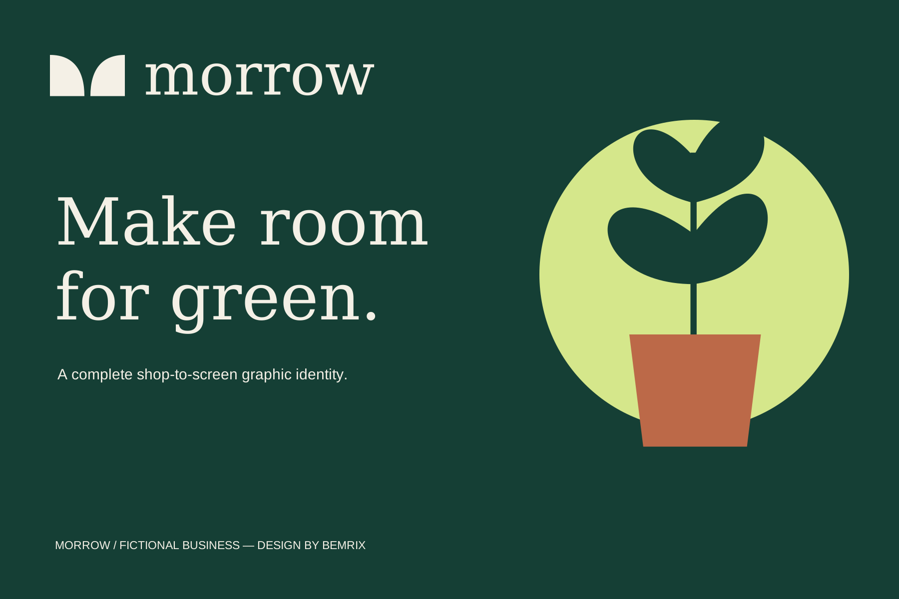
THE DESIGN BRIEF
One shop.
Every touchpoint.
The proposed audience is people making their homes a little greener. The goal: a friendly, considered identity that works on a large shop banner, small business card, printed correspondence and digital content.
Forest green anchors the system. Ivory gives information room to breathe. Citrus adds contrast, and terracotta connects the original vector illustration to the shop’s products.
Self-initiated concept by BEMRIX. The business, persona and contact details are fictional. No client commission, published campaign or commercial results are claimed.
01 / Business logo
Two leaves. One recognizable mark.
Paired leaf forms suggest an M, balanced with a generous serif wordmark. The restrained lockup carries across every application.
Download SVG ↓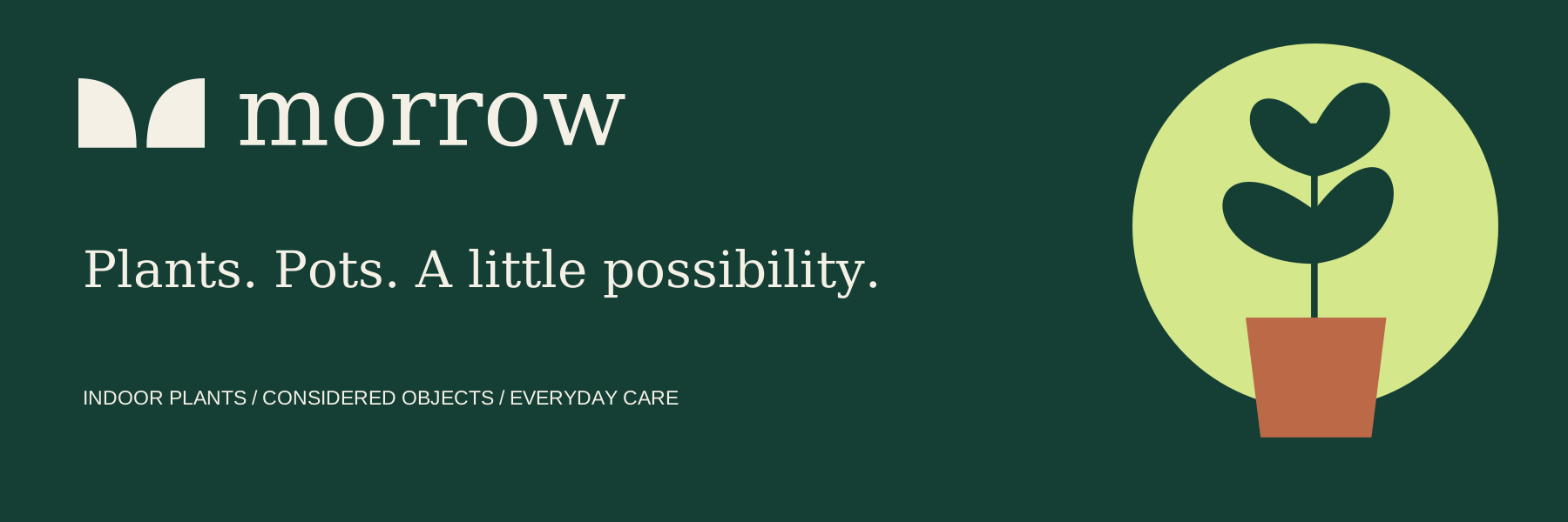
02 / Shop banner
Recognition from across the street.
A wide layout gives the business name and product categories room to read. The original plant illustration adds personality without competing with the message.
Download SVG ↓
03 / Business card — front
A quiet first impression.
An ivory identity on forest green keeps the front focused on recognition.
Download SVG ↓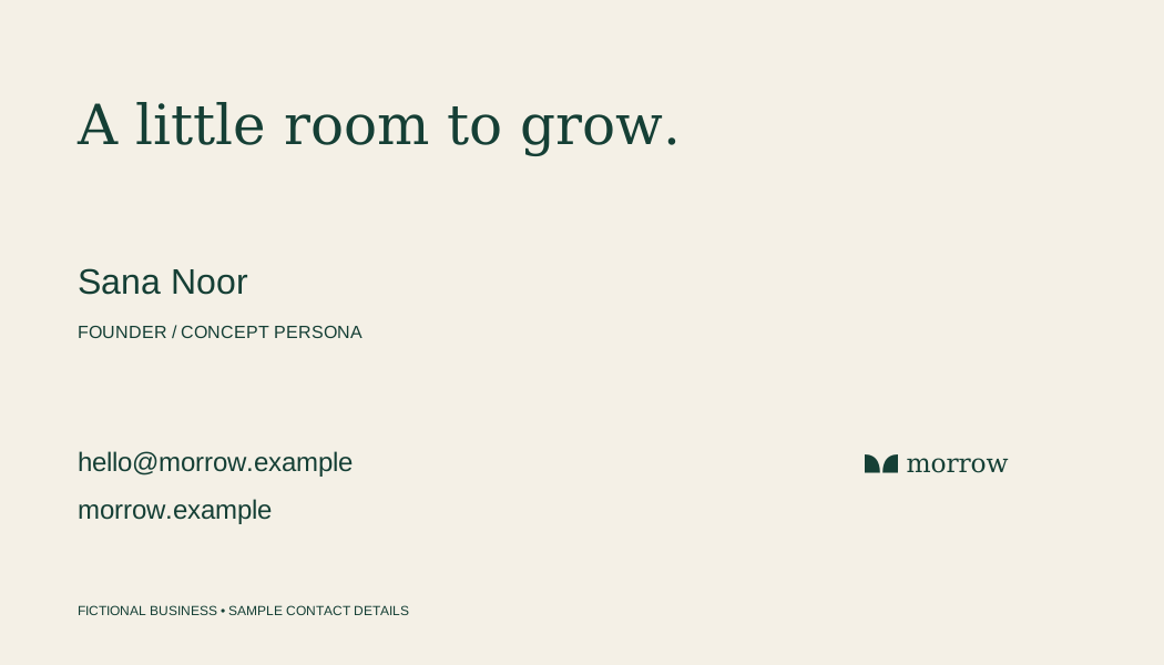
04 / Business card — reverse
The details, clearly arranged.
A fictional founder and reserved sample domain demonstrate the hierarchy without publishing real contact information.
Download SVG ↓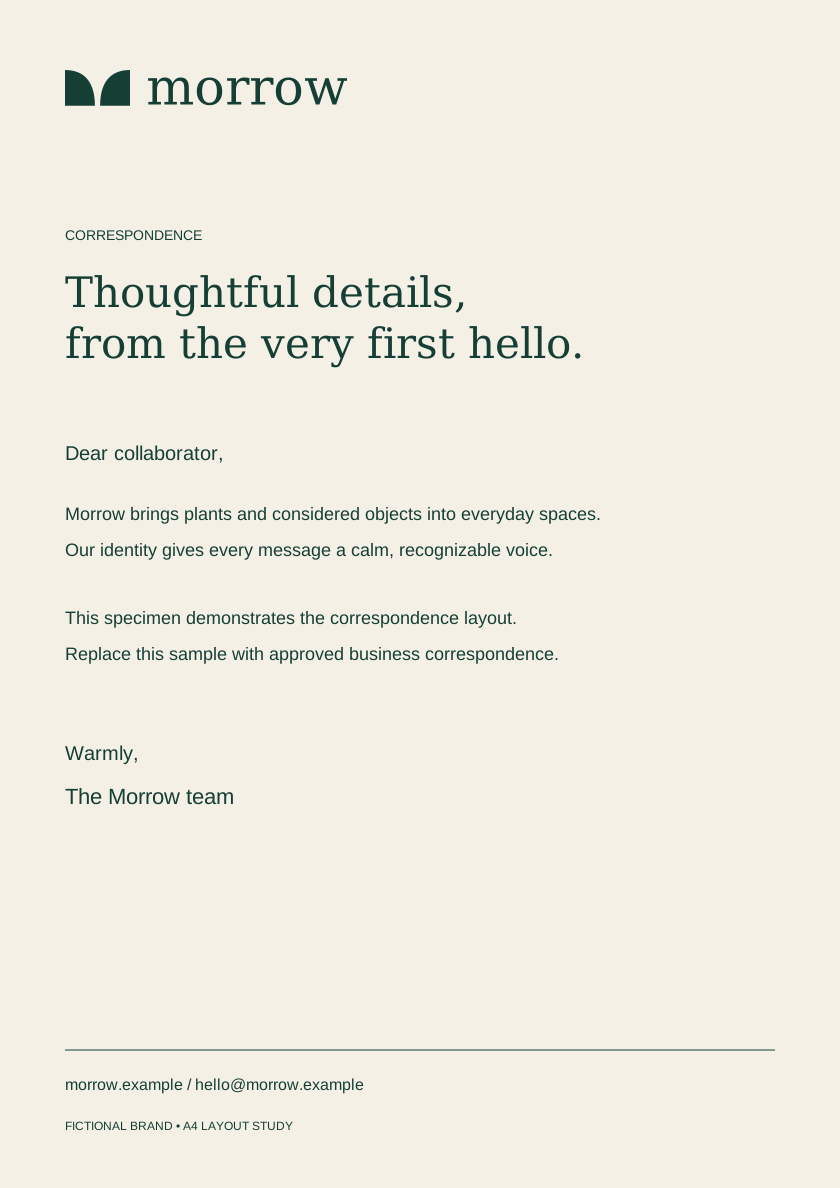
05 / Company letterhead
A consistent voice on paper.
An A4 correspondence specimen pairs an understated header with a clear footer and a generous writing area.
Download SVG ↓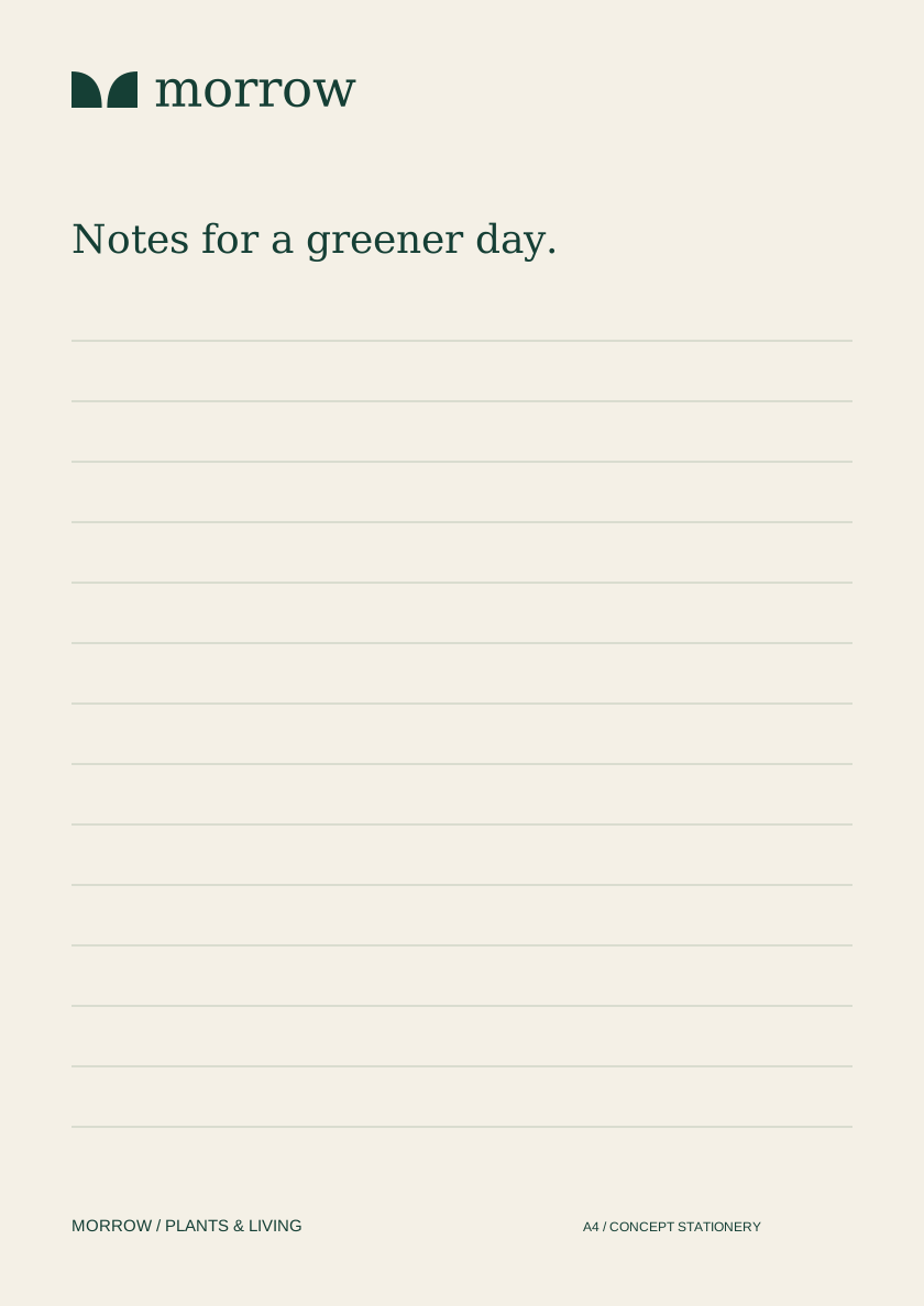
06 / Letter pad
Room for everyday thinking.
A ruled stationery layout extends the identity to handwritten notes, with a lighter use of the same visual language.
Download SVG ↓
07 / YouTube thumbnail
A recognizable series.
Large editorial titles, numbered episodes and a consistent illustration system give educational content a shared signature.
Download SVG ↓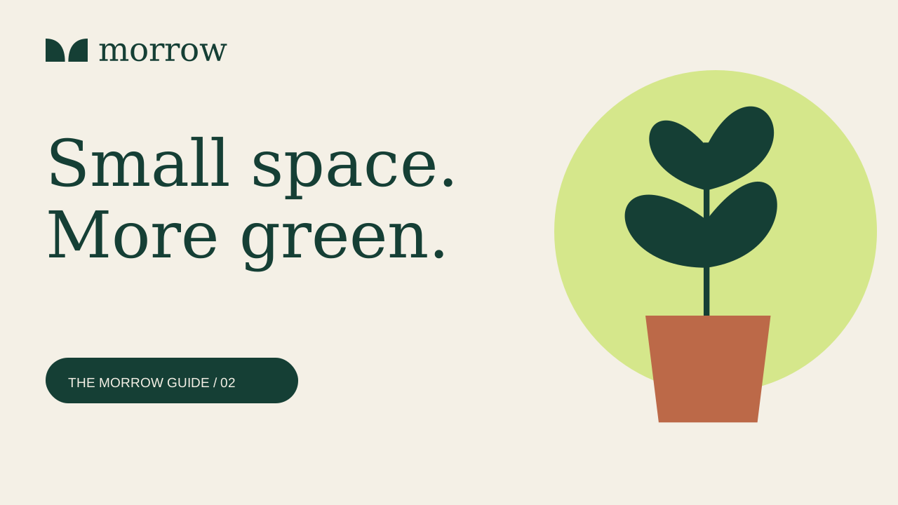
08 / YouTube thumbnail
Flexible, without starting over.
A second episode tests the system with a new title while retaining the recognizable structure and palette.
Download SVG ↓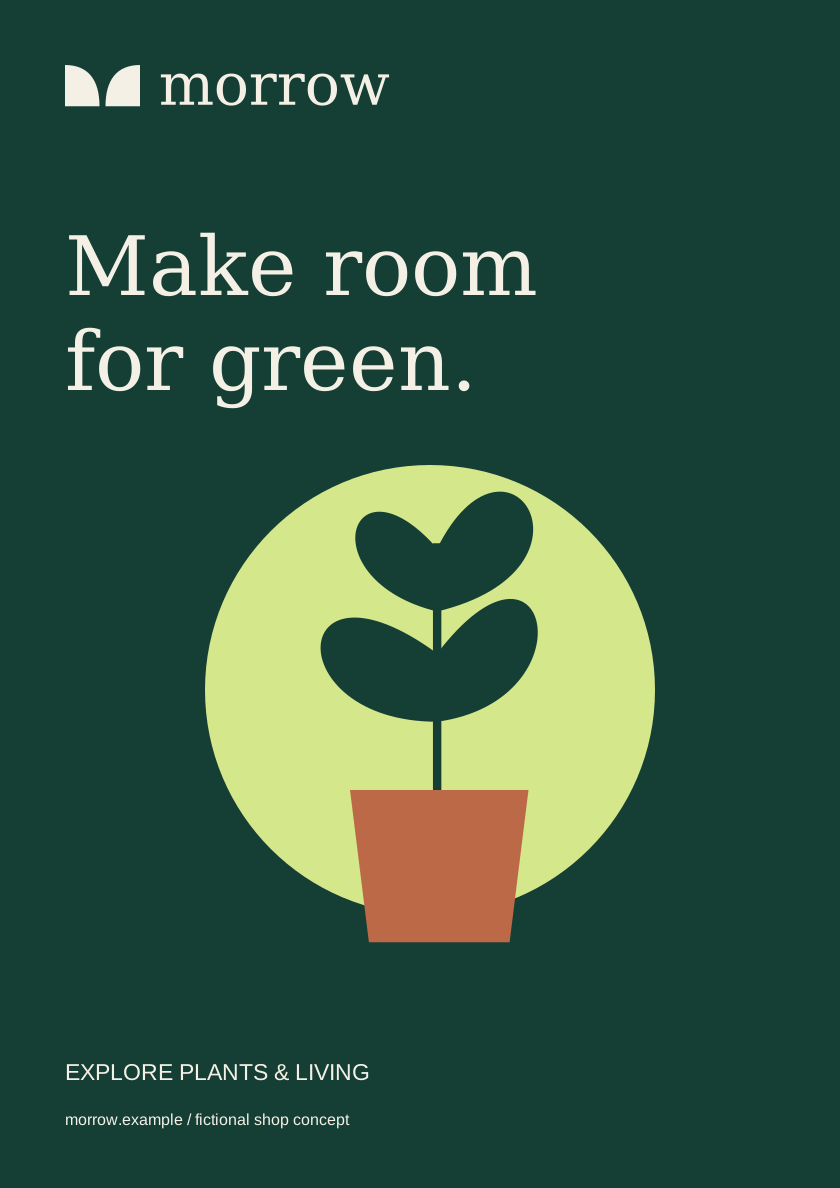
09 / Promotional poster
One message, made visible.
A portrait composition adapts the shop identity to a simple awareness poster with a clear destination.
Download SVG ↓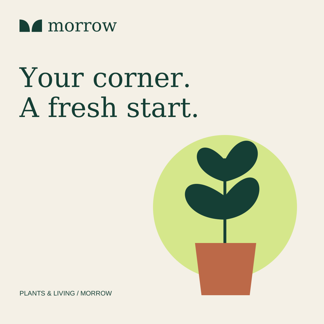
10 / Social graphic
The same shop, on a smaller screen.
A square composition brings the campaign into a social feed without changing the brand voice.
Download SVG ↓THE HANDOVER
Designed as a system.
Ready for refinement.
The kit includes 11 editable SVG files and a design guide. These are RGB concept masters with live text. Final dimensions, bleed, fonts, business details and a printer proof must be agreed before print production.
The letterhead is a layout specimen, not a Word template. Digital artwork can be adapted to the final channel requirements. The illustration and layouts were created for this project.