BRANDING & GRAPHIC DESIGN / SELF-INITIATED
A space for
what’s next.
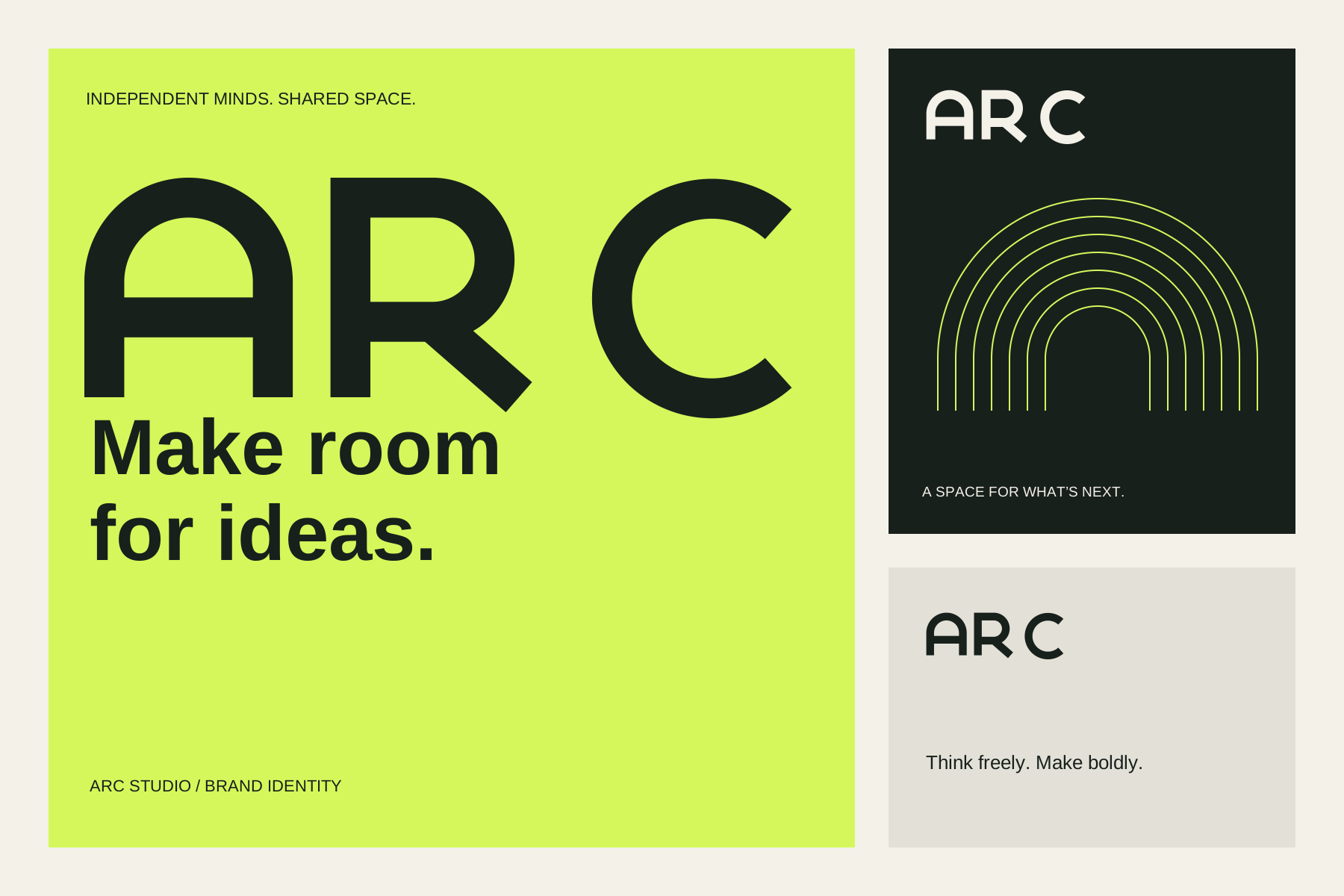
ARC Studio is a fictional creative workspace. We gave it a visual identity that pairs independent thinking with the energy of a shared space.
STRATEGY · IDENTITY · APPLICATIONSA BEMRIX portfolio project / 2026
01 / THE BRIEF
Room to think.
A reason to belong.
A creative workspace needs to feel professional enough for focused work and open enough for new connections. The identity had to speak to independent designers, makers and small teams without looking like a conventional corporate office.
Our response: a confident geometric wordmark, an electric lime accent and a repeatable arch motif. The result is a consistent set of assets for the places people first meet a brand.
- Audience
- Independent creatives & small teams
- Personality
- Open, curious, self-assured
- Core message
- Make room for ideas.
02 / THE SIGNATURE
One shape.
A shared visual language.
The arch in the A opens the identity. Rounded geometry carries into the R and C, while the R’s diagonal adds movement. A compact A mark gives the system a smaller signature.
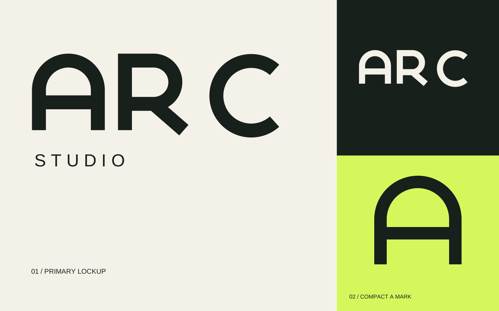
Recognizable geometry
Custom vector paths keep the wordmark consistent at any scale, without relying on a font.
Space to breathe
A minimum clear space of one stroke width protects the mark. The guidelines define size and background rules.
A useful motif
Repeated arches turn the signature into a supporting pattern for posters, covers and stories.
03 / COLOR & TYPE
Quiet structure.
An unmistakable accent.
Ink and Paper make the foundation. Lime brings energy to key moments. Straightforward Arial typography lets the custom wordmark lead, with bold headlines and readable supporting copy.
Make boldly.
Clear words. Deliberate hierarchy. Enough space for an idea to land.
04 / EVERYDAY APPLICATIONS
From first impression
to daily conversation.
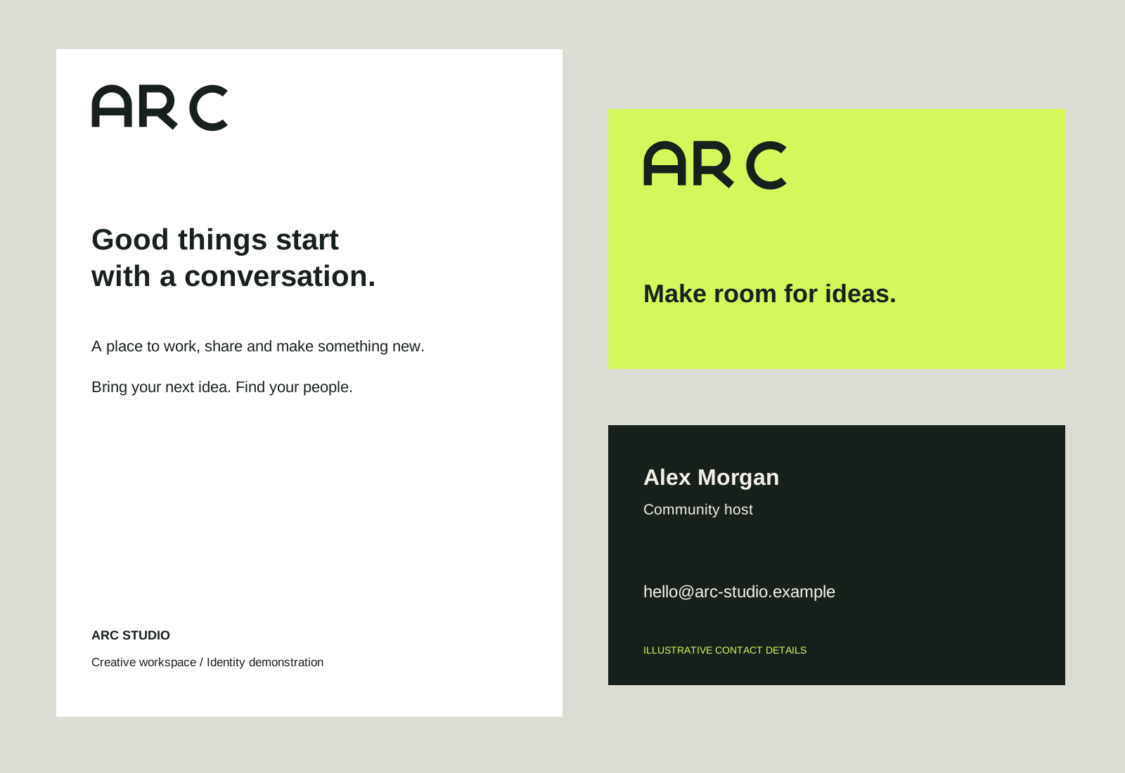
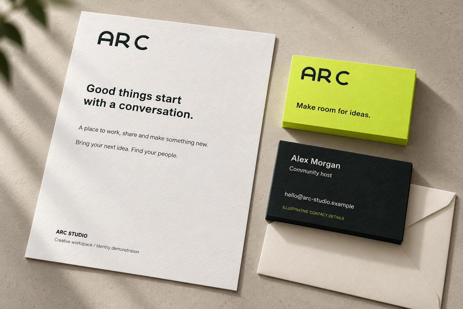
A coordinated letterhead and two-sided business card translate the identity into everyday materials. These are designed presentation layouts with illustrative contact details.
05 / A BRAND IN PUBLIC
One identity.
More than one format.
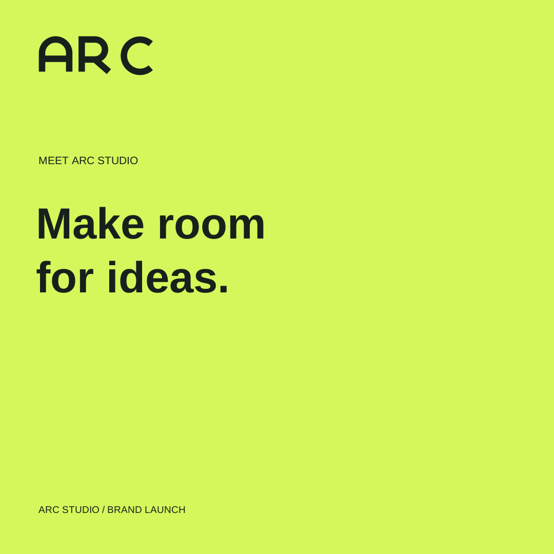
The launch graphic introduces the promise; the community graphic expresses belonging; the workshop graphic invites participation. A poster and vertical story extend the same language across different proportions.
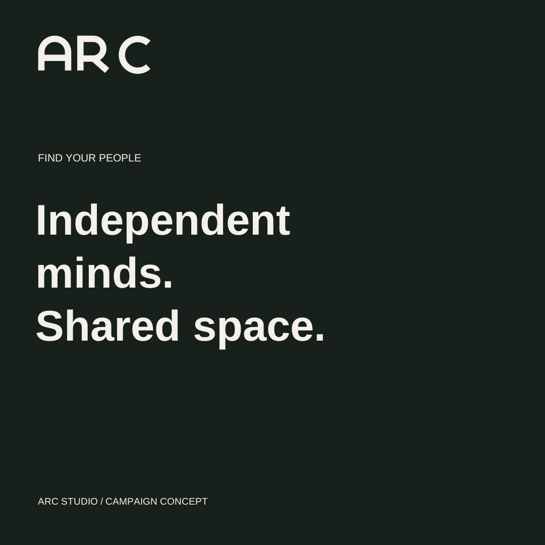
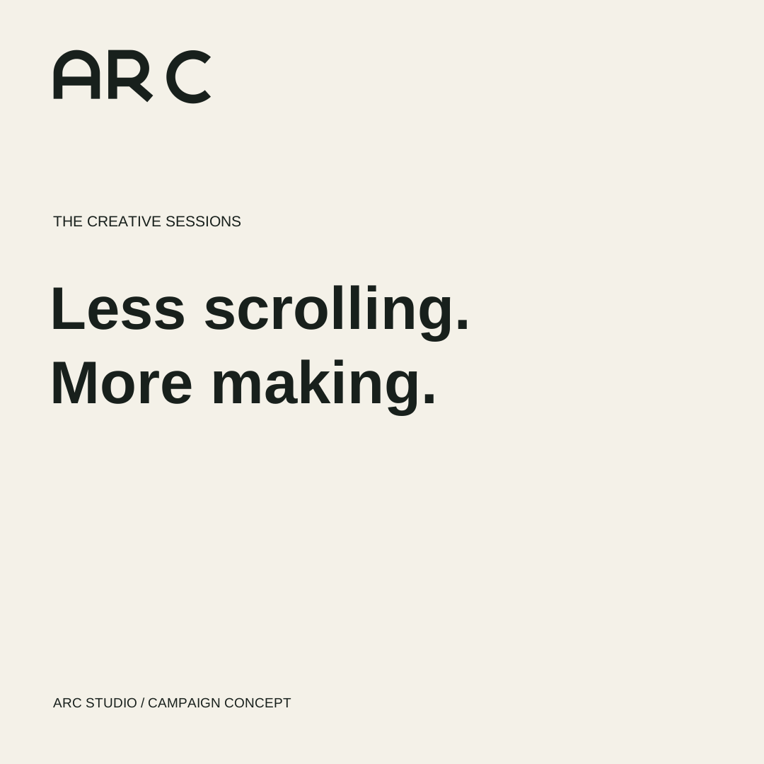
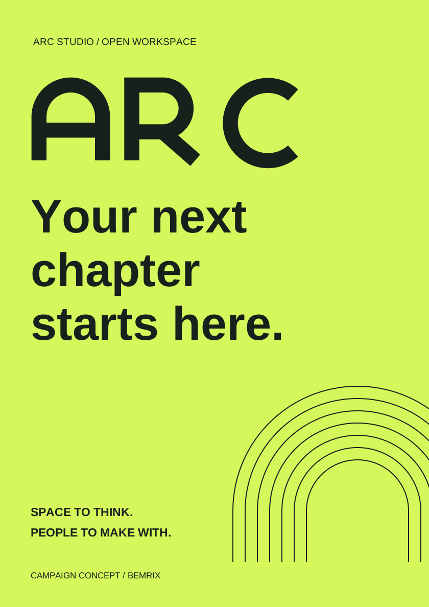
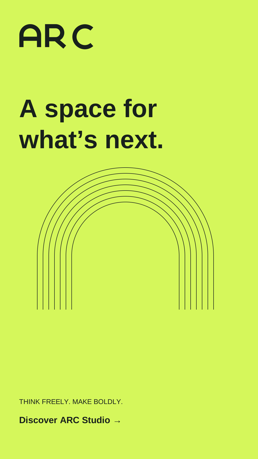
Consistency without repetition.
Color, geometry and type do the connecting. Different messages and compositions give each application its own purpose.
These are finished graphic assets for a fictional campaign. Publishing, audience testing and campaign results are outside this identity project.
06 / IN CONTEXT
A brand people
can picture using.
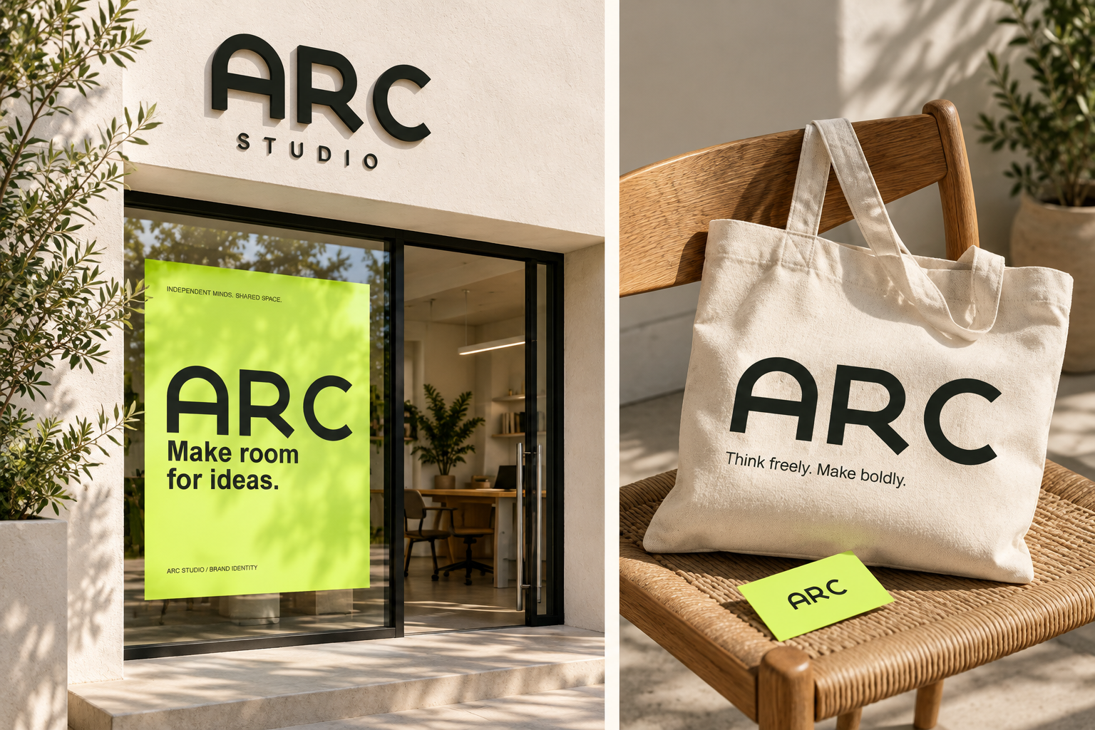
Entrance signage, a canvas tote and printed stationery show how the identity can carry across materials and physical spaces.
07 / THE HANDOVER
A brand you can
keep building with.
The downloadable kit includes editable SVG artwork, PNG exports and an illustrated HTML guide covering logo use, color, typography, layout and voice.
Self-initiated work by BEMRIX for a fictional brand. Application text uses Arial; font files are not bundled. RGB artwork requires printer-specific prepress preparation for commercial printing. No trademark clearance or commercial results are claimed.
Let’s make it happen