EMBER & OAK / BRAND IDENTITY & PACKAGING
A little warmth.
A slower moment.
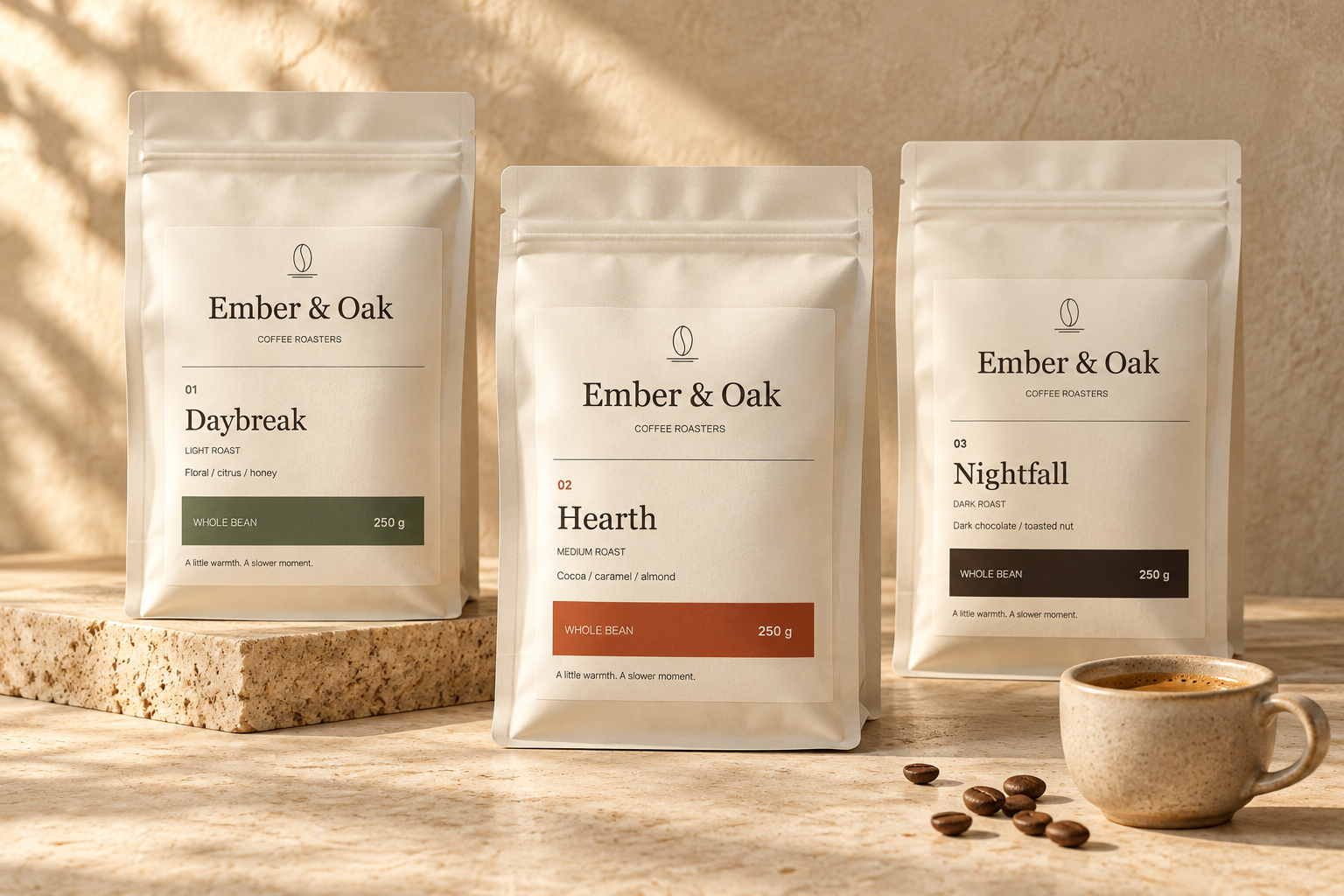
A premium coffee identity built around the everyday ritual of brewing. Warm materials, considered typography and a clear system for a growing product range.
SELF-INITIATED CONCEPTSTRATEGY · IDENTITY · PACKAGING · GRAPHICS
01 / BRAND STRATEGY
Make the daily ritual
feel considered.
The brief was to create a premium coffee brand that feels welcoming on a kitchen shelf. It needed enough character to be recognizable, with enough structure to make three different roasts easy to choose.
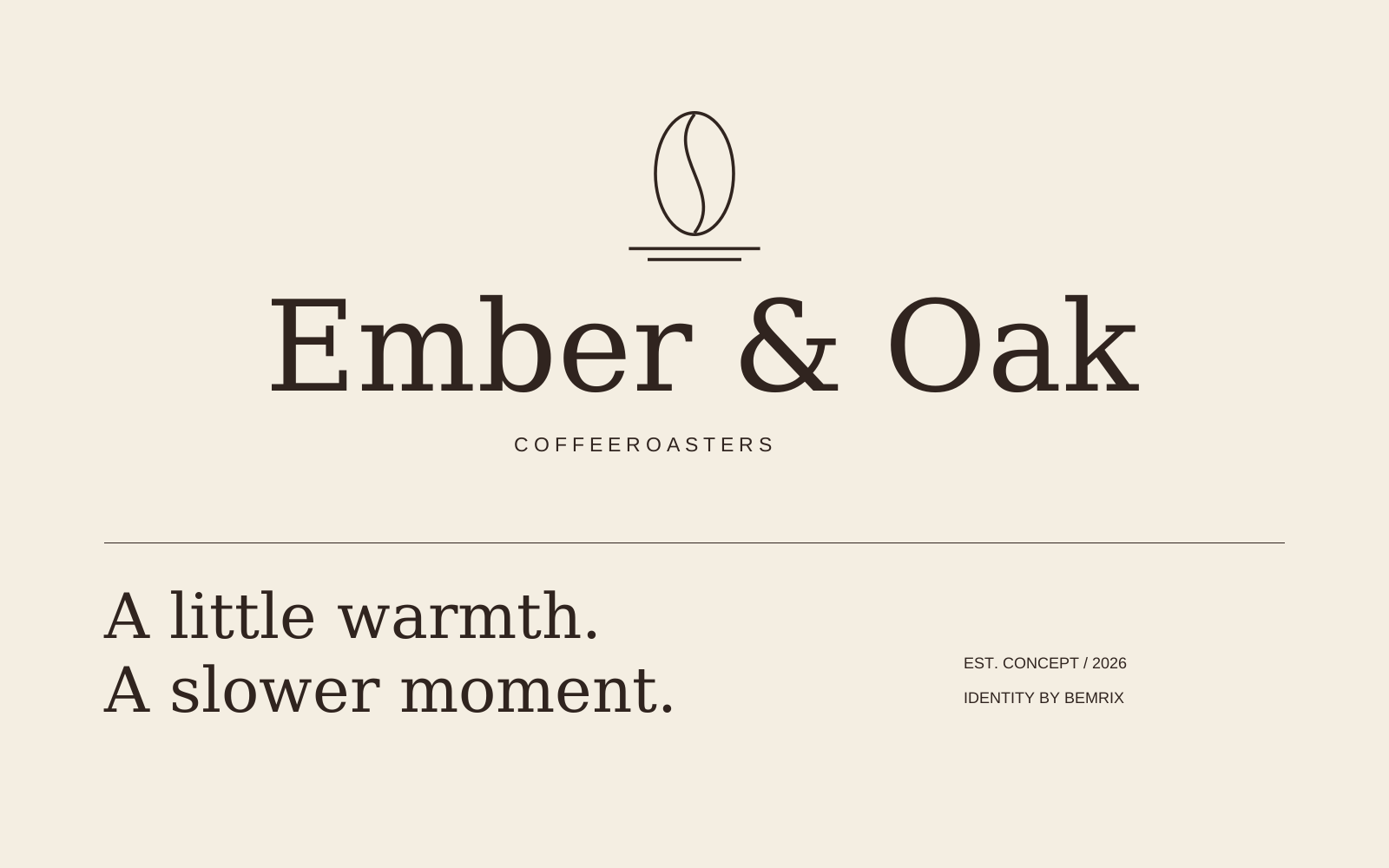
Ember brings warmth; Oak suggests something grounded and lasting. A typographic wordmark and a simple bean emblem establish the identity, while a restrained palette keeps the product information in focus.
- Audience
- Home brewers who value a thoughtful daily ritual
- Character
- Warm, measured and approachable
- Design task
- Identity, a three-roast label system and supporting graphics
02 / THE IDENTITY
Quiet confidence,
down to the letter.
Georgia’s serif forms give the name an editorial feel. Arial keeps the practical information straightforward. A line-drawn bean above two grounding lines provides a compact signature.
03 / THE PACKAGING SYSTEM
Three roasts.
One family.
The same layout carries every variant. A number, a product name, a roast description and a color band distinguish the range, so recognition never depends on color alone.
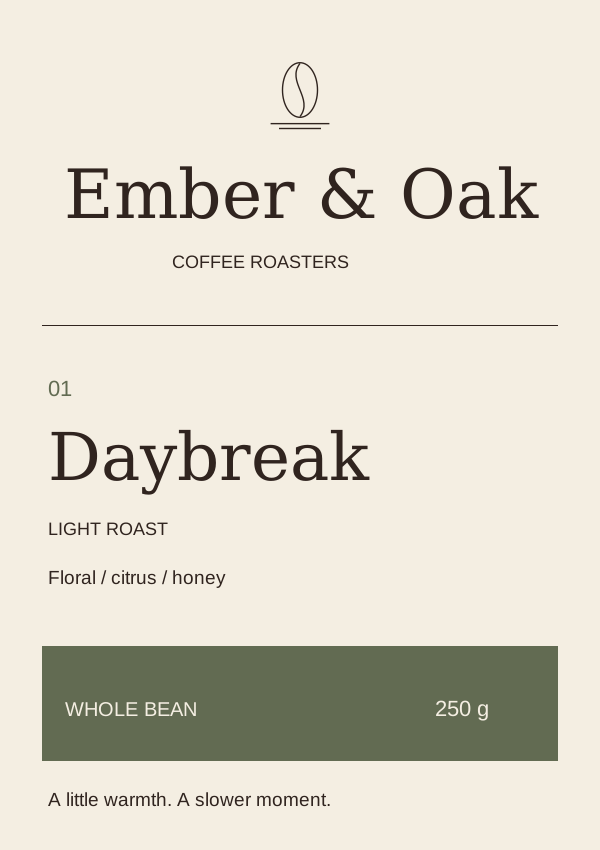
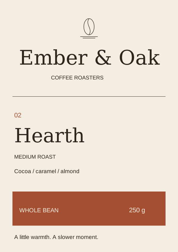
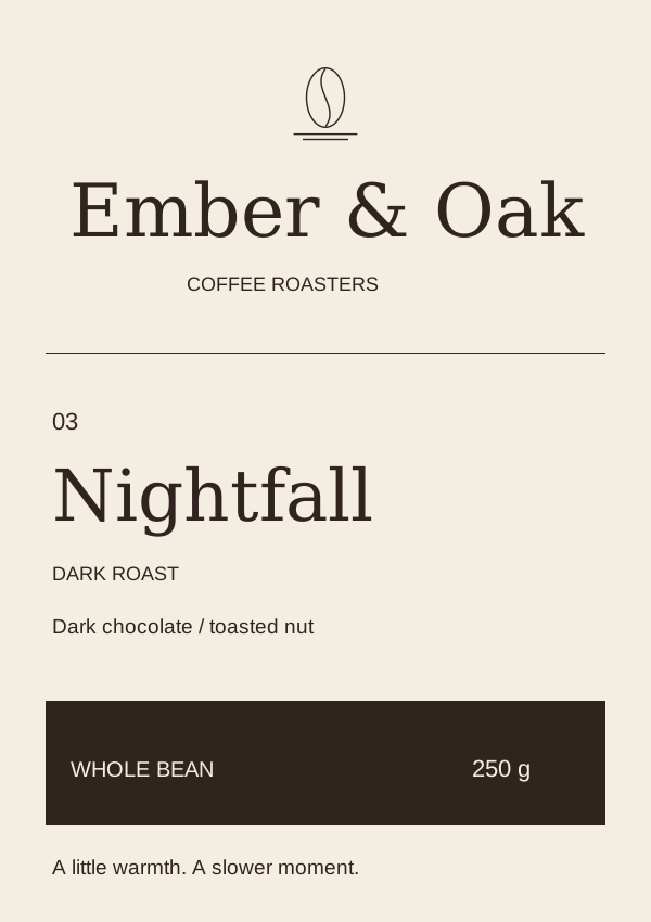
Illustrative roast descriptions and tasting notes for a fictional product range.
01 / Recognition
The brand name and emblem occupy the same position on every pack.
02 / Selection
Prominent variant names and explicit roast descriptions support a quick comparison.
03 / Practical details
Whole-bean format and net weight sit together in a consistent lower band.
04 / BEYOND THE FRONT
Useful details.
A consistent voice.
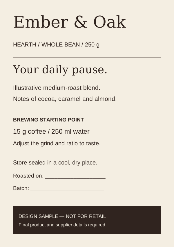
The back label extends the typography into preparation guidance, storage copy and space for batch information. A short message carries the brand’s warm, unhurried tone.
These are design concepts rather than production dielines. Final product information, supplier dimensions, mandatory pack copy and print preparation must be completed before retail use.
Explore our branding service ↗05 / SUPPORTING GRAPHICS
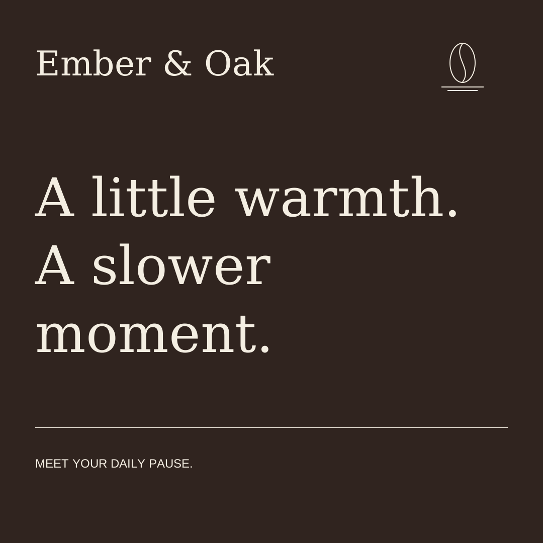
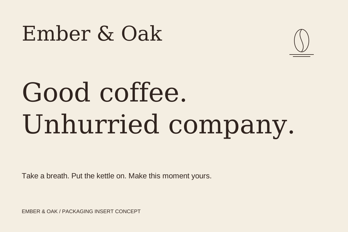
The same feeling,
outside the bag.
06 / THE HANDOVER
Designed to carry
the idea forward.
The kit includes editable SVG identity and label artwork, PNG exports, supporting graphics, a packaging mockup and usage guidelines.
Self-initiated work by BEMRIX. Ember & Oak is a fictional portfolio brand. The mockup is AI-generated; SVG files are the authoritative artwork. Fonts are not bundled. No real product launch, trademark clearance or sales results are claimed.
Let’s make it happen