BEMRIX / UI & UX DESIGN
Make the handoff
feel straightforward.
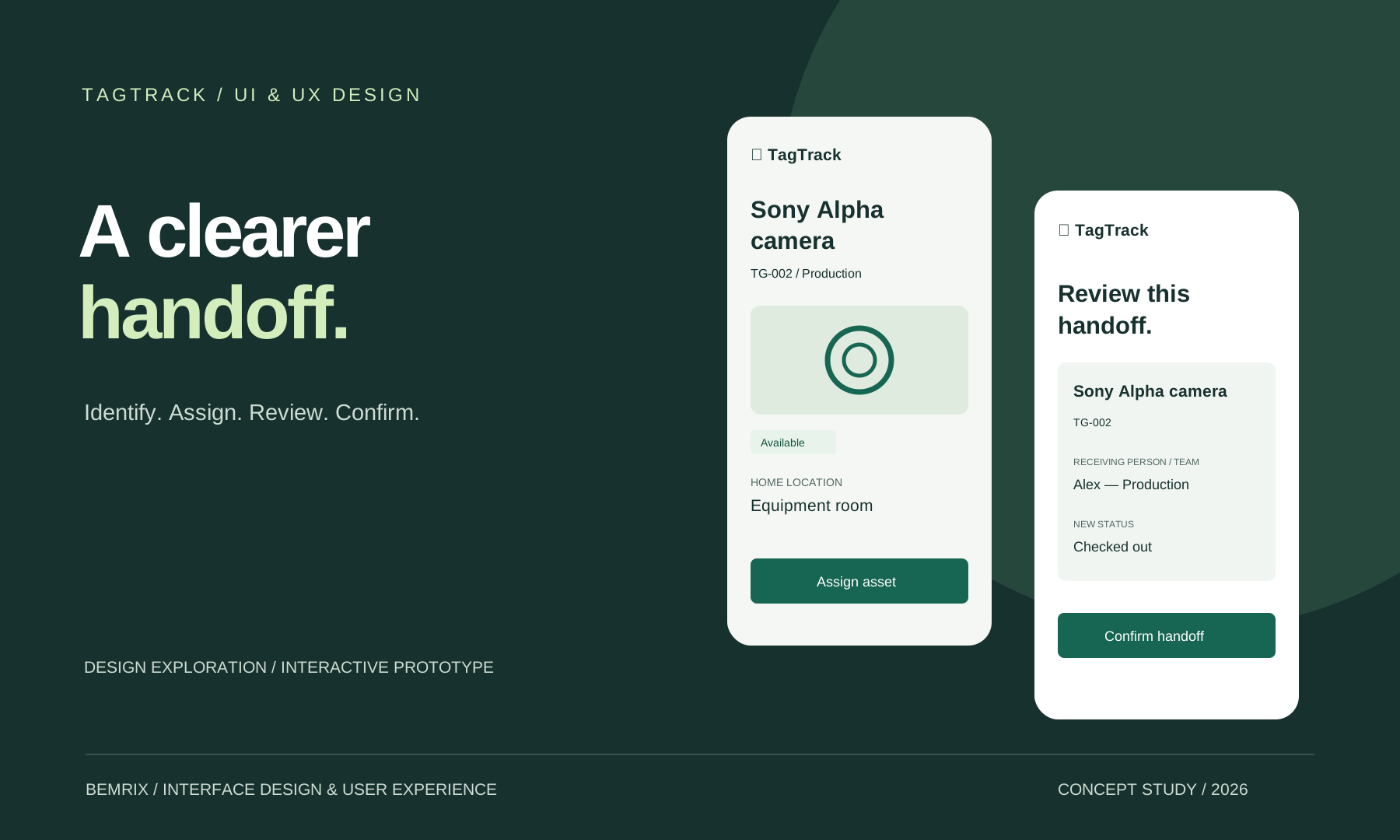
A focused design exploration for TagTrack: help a team identify equipment, assign it with confidence and understand what changed.
Self-initiated design study · Fictional scenarios · Proposed interface, not a shipped Flutter update
THE DESIGN BRIEF
One task.
A clear end-to-end flow.
TagTrack already connects QR labels to asset records, check-outs and returns. This study focuses on one everyday task: handing equipment to another person and recording its return.
The brief is to make the asset, recipient and resulting status explicit at each decision. It preserves the existing safeguards while exploring a more focused mobile layout.
See the existing Flutter application →PEOPLE & CONTEXT / WORKING ASSUMPTIONS
Design around the handoff.
“Who has this, and can it go out?”
Needs asset status, its home location and the receiving person before changing a record.
“I have a label. Find the right item.”
Needs a route from a printed code to the asset, including a fallback when the camera is unavailable.
These roles and scenarios are design assumptions derived from the product’s purpose. No interviews, observational research or participant quotes were collected; the statements illustrate the intended tasks.
HEURISTIC REVIEW / SOURCE & SCREEN INSPECTION
Keep what works.
Refine the moments that matter.
A focused primary action
Existing: asset details group check-out, maintenance and editing controls with the record and QR identity.
Exploration: foreground assign or return for this focused task. Maintenance is visibly unavailable; editing is outside the prototype’s scope.
Context before confirmation
Existing: check-out uses a required assignee field in a confirmation dialog.
Exploration: add a dedicated review screen with the asset, recipient, location and new status. This adds a step; its value needs user testing.
A visible way to recover
Existing: manual lookup and camera/storage error feedback already exist.
Exploration: keep those alternatives, with inline recovery copy and retained input after a simulated failed save.
INFORMATION ARCHITECTURE & TASK FLOW
A small set of places.
A deliberate sequence.
Inventory
Search → status filter → asset detail
Identify
Sample scan or manual code → asset detail
Activity
Review handoffs made in this session
- 01Identify the asset
- 02Enter the assignee
- 03Review the change
- 04Confirm & see the result
Unknown code → correct the code or browse. Failed save → keep the details and retry. Return → review the current assignee and home location before clearing the assignment.
WIREFRAMES / EXPLORATION CREATED FOR THIS STUDY
Settle the hierarchy first.
Start with the decision each screen supports. These wireframes document this exploration; they are not presented as historical research artifacts from the original app.

01 / Orient. Put identity and availability before the action.
02 / Ask. Request one necessary piece of information.
03 / Confirm. State the change before applying it.
EXISTING → PROPOSED
The same asset.
A different emphasis.

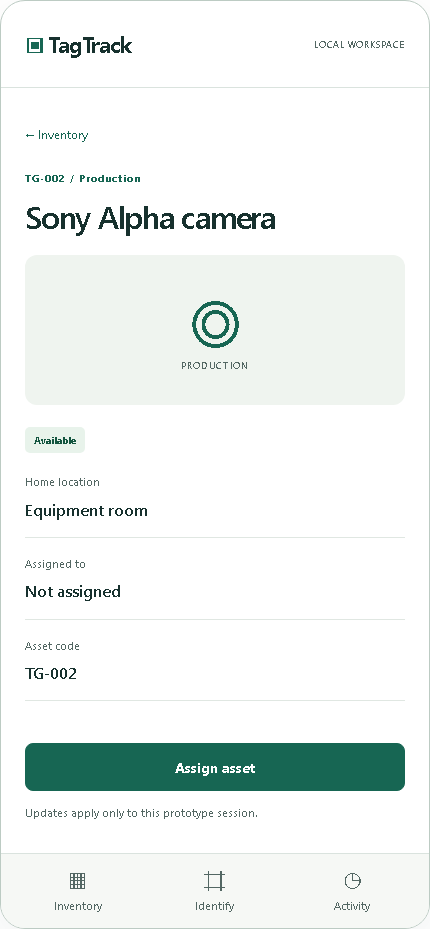
HIGH-FIDELITY SCREENS
Make every state understandable.
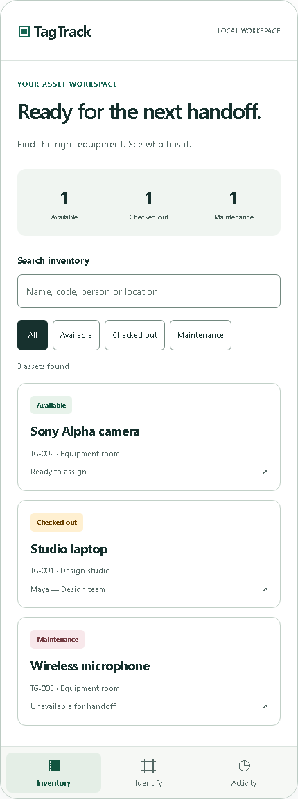
Find the right asset
Status words support the color labels. Search and filters work together.
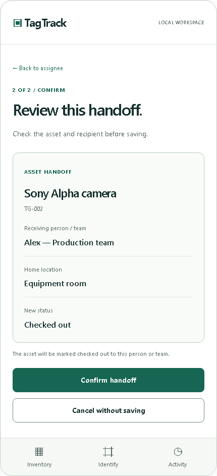
Review before saving
Keep the asset, recipient and resulting status in the same view.
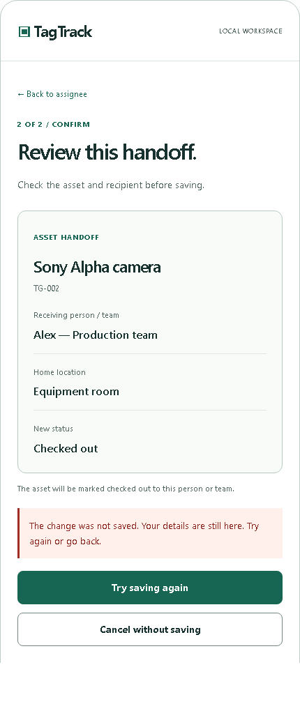
Recover without retyping
A simulated failed save preserves the entered assignee and offers a retry.
Screens captured from the working React prototype. Sample assets and names are fictional; camera and save failure are simulated.
A REUSABLE INTERFACE LANGUAGE
Consistency beyond
one screen.
Shared status labels, buttons, fields, asset summaries and confirmation patterns establish a compact handoff system. The kit includes token values and state rules for implementation.
Download the design tokens ↓#17312EAction
#176653Surface
#F4F7F4
16 px base body · 8 / 12 / 16 / 24 px spacing · 44 px minimum prototype button height · Visible focus · Labels that do not depend on color
VALIDATION & NEXT RESEARCH
A testable direction.
Not a claimed outcome.
Browser checks cover the assignment and return flow, cancellation, input errors, unavailable-camera fallback and save retry. Keyboard focus, control sizing and selected color pairs are checked separately.
These are implementation checks, not usability research or a full accessibility audit. No completion-time improvement, satisfaction score or WCAG conformance claim is made.
Next study: ask equipment coordinators and team members to complete the same tasks in the existing flow and this prototype. Observe wrong-asset assignments, hesitation at the review step and recovery success. Decide whether the extra review step is worth keeping.
Read the usability session guide ↓EXPLORE THE WORK
Go from an asset
to a completed handoff.
Try the prototype, inspect the states or take the design handover into your next review.
Explore UI/UX Design →Let’s make it happen